
With a tiny percentage of websites failing to meet the standards for accessible design in 2022,...
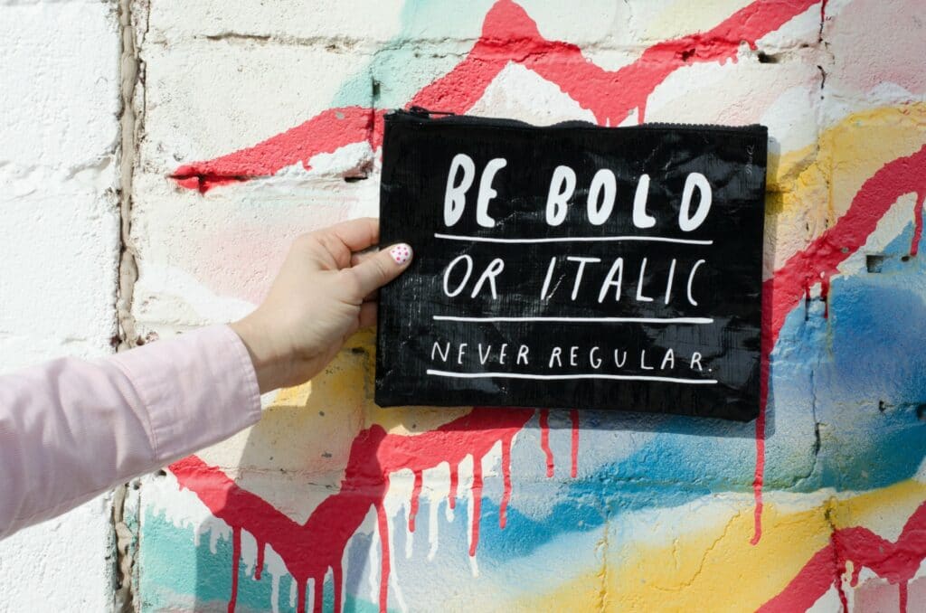
Typography is an undermined topic in London web design. It plays an important role in websites by ensuring that we can easily read and understand its content. As a website owner of a medium sized company, you need to check the readability and visibility of your text to ensure an easier user interface.
In this article, we will take you through everything you need to know about typography. We will have a look at what typography is, its importance, some basic typography elements, how to choose the right typography for your website and testing the typography.
What is typography?
From a general perspective, typography determines how words look to a reader or how they appear on screen or page. It helps improve the text that we see on websites. Digital text is designed for reading and the following:
- A shorter span of attention: this needs a text that instantly drives the point home.
- Accessibility: not all users interact with web content in the same way.
- Skimmability. Readers look for something particular in the text and need to find it fast.
- Different types of devices and screen size: text should be readable on any digital device.
In addition, typography involves how text is presented on the web page and how the look of the text is designed.
Importance of typography
Typography is a crucial part of London web design and does not only involve choosing attractive fonts. Good typography establishes the tone of the product, strong visuals, and graphics website balance. Typography guides the users by optimizing accessibility and readability offering a great user experience.
So, why is typography important?
Influences decision making
Typography affects how the user consumes and perceives the information delivered by the text. An attractive font is more persuasive than a weak font that doesn’t highlight the main message of the text.
Builds brand recognition
Typography gives your website a unique personality making users associate with your brand. A unique and consistent branding will create a solid user following, build trust with your customers and help scale your brand.
Captures readers attention
Good typography defines the time spent on your website. Your website should be eye-catching and memorable.
Basic typography elements.
Typography consists of fundamental terminologies. To have a grip on typography, every WordPress agency needs to understand these basic typography elements.
Fonts and typefaces
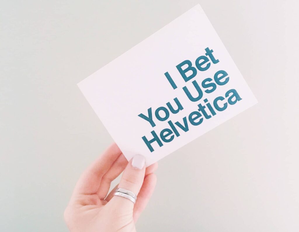
Typefaces and fonts could be confused as the same thing but they aren’t. A typeface is a design that consists of characters of different weights and sizes. They include Calibri, Times New Romans, Helvetica, Arial, and Courier.
A font is a specific instance of a typeface. It has a specific weight i.e. might be lighter or bolder and have different styles i.e. rounded or unrounded, italicized or not italicized. To make your WordPress website stand out you can use custom font. You can add new custom font files to your Elementor plugin such as WOFF, TTF, EOT, WOFF2 or SVG.
Consistency
Making your typefaces consistent prevents a messy interface. Sick to the font style when delivering a message for readers to easily understand.
Contrast
Contrast helps emphasize different ideas or messages to the readers. It makes your text more attention-grabbing and interesting. As a web designer, you can use different typefaces, styles, colours, and sizes to break up and impact the page.
Alignment
It is the process of unifying and composing text, images, and graphics to ensure equal space, distance, and size between elements. Some designers create margins for aligning the text, logo, and headers together. Pay attention to industry standards when doing this. Aligning to the right sounds counterintuitive to the left to right readers.
Whitespace
This is the space between graphics and text. Proper use of white space improves text readability. It takes the form of padding, margins, or blank areas without text.
Hierarchy
Hierarchy is a vital aspect of typography. It highlights the text that should be read first (primary) and the less important text (secondary). Designers are obliged to be concise by creating typefaces that allow users to get information as fast as possible. Hierarchy is arrived at through alignment, sizing, contrast, and colour.
Colour
Colour is an exciting element in typography that stretches the creativity of London web designers. Font colour determines whether the text stands out and delivers the message or not. The three components of colour include saturation, value, and hue. An experienced designer will know how to blend these components and come up with compelling text even for the visually impaired. Web designers test this through the grayscale method (viewing it without colour) and making changes against the background colour if the text is too light or dark.
Serif and Sans Serif fonts
There are two types of fonts Serif and Sans Serif. Serif is a projection from the main stroke of a letter. Sans is a French word that means ‘without’, hence, a Sans serif is a letter without ornamental projections.
Tracking
It defines the spacing between characters. It is spacing within a whole block of words rather than between two letters. It tells whether a text is too squeezed or wide apart.
Kerning
This is the horizontal space between two characters. There are smaller or wider kernings in fonts to avoid big gaps and improve readability.
Leading
This is vertical space between texts. It can be double or single spaced and is expressed in points (pt) or pixels (px)

How typography influences online learning
While developing online content it is important to consider the visual and instructional design. They affect the whole communication process. Using typography strategically critically affects the visual design and impact of an online course. According to research, learners attach personalities and emotions to fonts.
Web designers can use Google Fonts which is free through adding Java Script or CSS into their source code. Google Fonts is a library of interactive programming interfaces that enables users to use fonts in their websites.
Let’s have a look at types of learning environments and how typography can be used in each case.
The font in print study material
Serif fonts are preferred since our brain easily processes them. They are used as body text to prevent burnup from reading. Common fonts used in print are typefaces such as Times New Roman, Garamond, and Century.
Mobile, web, and online course fonts.
Sans Serif fonts are easier to read on computer screens. Serif fonts are hard to read due to low computer screen resolutions as compared to print. The fonts can bring up different feelings based on their design. Readers can engage with the content or disengage altogether. Higher educational courses require serious, professional, and warm fonts.
Common fonts used by WordPress Agencies for designing online course content are Futura, Helvetica, and Arial. Mobile and web apps use Sans Serif fonts since they do not stress the eyes. Fonts used for mobile and web apps are Montserrat, Roboto, San Francisco, Open Sans, and Nunito Sans.
K-12 segment fonts
Fonts for school kids can be different. Content for younger kids uses bright-colored fonts to attract attention. When children grow their attention shifts to less colourful fonts but are still easier to read and understand.
Gaming fonts
Typefaces used in games denote the game setting and help the gamers have an idea of the game’s content. Games have many onscreen texts i.e. story settings, instructions, hints, and scores that require to be communicated fast and easily. Content readability is most important. Players access the games in various languages and devices and the chosen font should be similar to these practical needs.
Accessibility support fonts
When choosing the best fonts ensure how accessible it is to people with difficulty reading text. Put in mind the following points:
- Choose readable and simple fonts.
- Use three fonts maximum
- Make sure there is ample contrast between the text and background.
- Avoid moving text.
- Do not use text with graphics.
- Use different colour variations for the sake of visually impaired persons
- Use a 12 pt font and above.
Guidelines to website typography
Through years of experimentation, we have come up with the best website typography practices. These practices will ensure that your website’s typography is up to par and keeps the users reading.
Use fewer typefaces
You can do fine with one typeface and apply different fonts to the typefaces like button text, headings, or body. If you use more than two typefaces choose compatible but visually different options.
Always use Sans Serif font for body text
Like we said earlier Sans Serif fonts are readable in digital text unlike Serif text in print.
You can still use a serif font in websites in a decorative section, heading, title, or pull quote to capture attention. However, Sans texts make content more readable and understandable.
Use standard fonts when you start.
This means using compatible fonts for the text to be read and understood on different devices. Web-safe fonts function on any device. If a font is not recognized it could be set to a default font which may look pathetic. The standard font is common online and readers are accustomed to it. They will be able to read or scan through it quickly.
Choose the best text size.
Most London web designers prefer pixels to points when defining text size. Point is not a standardized unit online unlike pixels. Website text should be set to 16px. This is the smallest font people can read without having to zoom in. Headings should be bigger than body text. You can decrease the headings and subheadings through H1, H2, H3, and so on. This helps the readers scan your pages for specific content.
Avoid using all caps
All caps is used for branding, decorative text, and some sets of headings only. If you need to add emphasis to the body or heading text it is better to bolden it.
Carefully use colours with the right intentions.
One common sin among WordPress agencies in London is poorly pairing background colour with text colour resulting in poor contrast. Do not use text on a background with the same colour and be careful when placing text on images. You can never go wrong when using black text on white background.
Apart from contrast, check the colour of the text. Use similar colour in body text apart from hyperlinks which should be different from the rest of the text. Avoid using green or red visual cues since they will not appeal to persons with red-green colour blindness. If you want to put more emphasis on a text snippet combine stylings like bold, italics, or underline with colour.
Use 40 to 80 characters per line
Human beings are choosy readers who favor lines of text with between 40 and 80 characters. Shorter lines force us to quickly move to the next line which is distracting. Longer lines will bore readers and will require more effort to find the beginning of the next line since the eyes move to the left side of the text block.
Put enough space between lines.
Ample white spaces enable the reader to easily follow the first line and the second line after a line break. Vertical space is allotted by accessibility frameworks based on the size of the text. Body text should have 1.5 spacing. The distance should be longer for headings and should have a spacing of 2.5 between paragraphs.
Do not use text animations
Flashing text may seem appealing but is worse for readability. Readers may confuse it for an advert and avoid it. Flashing text and images can also cause photosensitive seizures. Ensure that you use static text. Moving text makes it hard for the reader to stabilize it in their brain.

Testing the text
These guidelines will help you get ready to begin experimenting with fonts, typefaces, and styles for a better reading experience. However, there is one last frequently an unforeseen problem. You could follow all the tips in the guideline and neglect some things that a below-average visitor would notice. This is why user testing is always the last stage in London web design.
You need to find many users who can give you insights into the readability of your website. It is not important whether you are publishing some product descriptions or an online novel. Human feedback assures you that your website is readable and satisfying.
Typography can be underestimated in web design but is an important part of user interface design. Mastering the art of typography will help you become a professional user interface designer. If you do not have any idea of where to start you can consult a WordPress agency for professional web design services.